1
2
3
4
5


Esports brand design focusing on minimalism, color, and contemporary difference.
Team Voltic Wordmark
With the lightning bolt finishing the V with a golden strike drawn on a piece of notebook paper, Team Voltic was born. The idea was to have BOLD text and a touch of color that could be translated to any scheme I deemed fit: gold, white, grey, black, even seasonal colors if necessary. A contemporary word mark in esports culture means sans serif, and thin kerning to compensate for the small detail we prefered.
Team Voltic Logo
The V with the lightning bolt was immediately crowned a crowd favorite in the SMITE community, because of the difference in design from other traditional brands that came and went. Voltic was designed with love and the intention of staying a figure in the scene that grew along with their players.
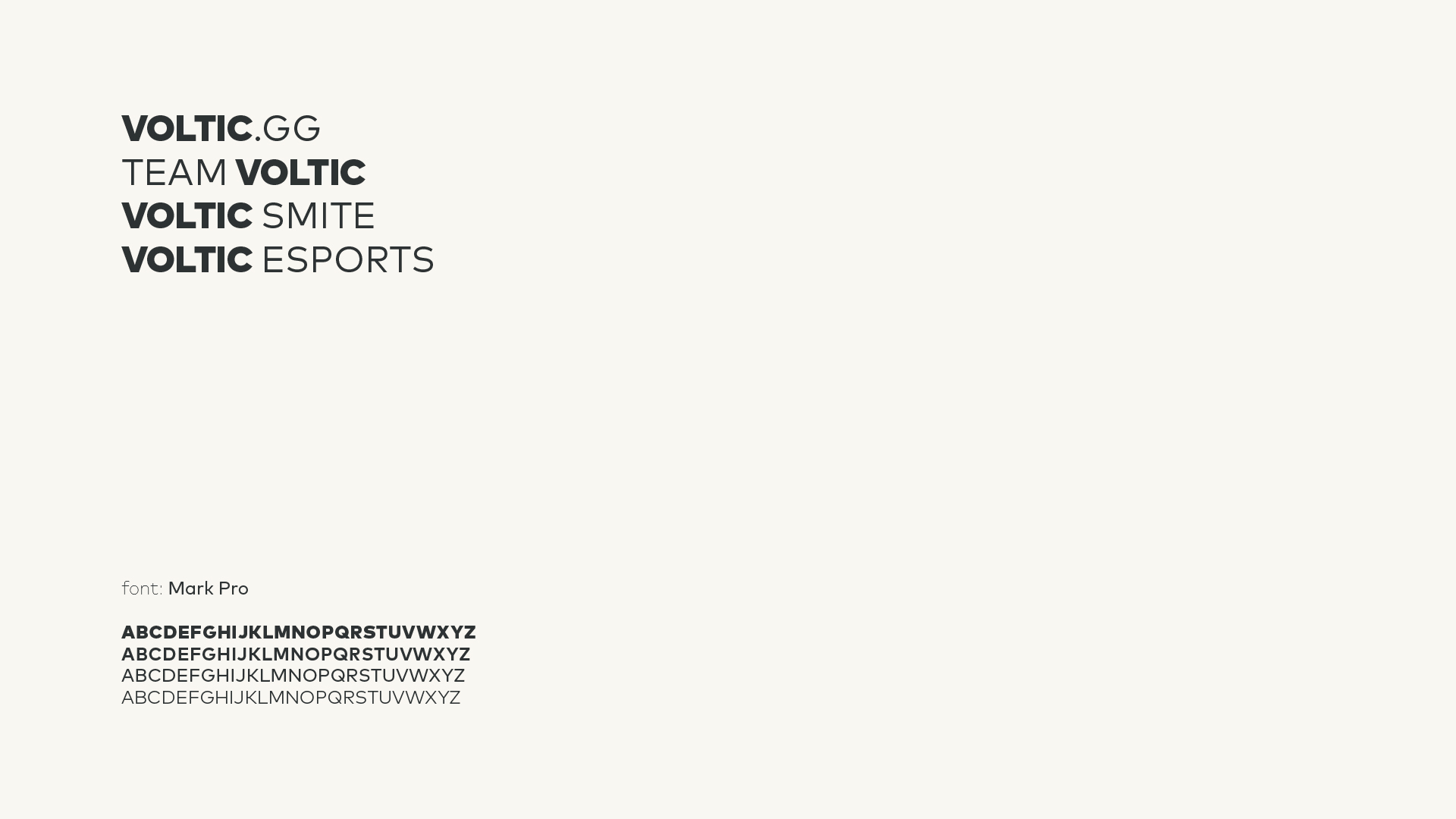
Team Voltic Font
MARK PRO was the choice for Team Voltic due to it’s potential to separate itself even from bold to regular with efficiency and visual ease. The name was created before the logo/wordmark, so Team Voltic was a choice considered along with Voltic GG, Voltic Esports, and Voltic Smite.
Team Voltic Clothing
One thing that is very apparent in esports is how poorly designed the clothes are. Maybe not ‘poorly designed’ but very derivative of each other and no modern example makers. For one, we didn’t want a jersey: they’re bland, they’re materially uncomfortable, and they look bad in print. I created bomber jacket and t shirt combinations that were completely modern and never before seen to be worn by our players while playing, for style and comfort.